if someone mentioned the word “style” to you, i’d venture to say that you’d immediately equate that word with clothes. but the truth is, style can relate to a number of things like food, or in the case of today’s topic –your home. second to your wardrobe, how you choose to style the interior (and exterior) of your home is a direct reflection of who you are. do you prefer the minimalism of modern design or are you gravitated toward the homey feel of shabby chic? are your walls splashed with bold colors or did you keep it simple with all white? are you all about the D-I-Y or more likely to B-U-Y?
the truth is, we spend most of our lives making memories between our home’s four walls, we might as well fill them with pieces, colors, textures, photographs, and details we absolutely love!
for me, styling my home has been a labor of love over the course of this past year. when i first moved into my condo, i wanted to evoke beachy-vibe; an homage to the sleepy surfer town i had lived in my entire life. i chose to paint the walls pastel versions of green, yellow, and blue and scoured the likes of target, home goods, and bed, bath, and beyond for anything shell/boat/water-adorned to decorate my rooms and walls. but similar to how my personal clothing style has changed in the past seven years (thank goodness), the look and feel i want for the interior of my home has also evolved since moving in the summer of 2007.
now inspired by neutrals and heavily influenced by the impeccable eye of miss joanna gaines (of fixer upper), i’m focused on transforming my space into an oasis filled with all of my favorite things. accordingly, little by little, S and i have spent the past nine months making changes to my home. from new living room furniture to new paint on the walls, with each fleeting moment of free time, we’ve gained ground on the seemingly never-ending list of to-do’s. and for the first time in a while, i can start to make out the light at the end of the tunnel. and it feels darn good.
the latest mini victory has been tackling the master bathroom. and when i say it has been “tackled,” i mean that S has basically done everything and i’ve paid him in compliments, homemade dinners, and hugs. in reality, i’m more of the designer/visionary and S is the contractor/”get things done”-er. clearly, we make a great team. anyway, the color scheme keeps within the neutral palette i’ve honored throughout the house -tans, whites, greys, blacks, and metallics and though it’s not 100% finished yet, i wanted to share a few fun pieces i’ve collected over the past few months to bring the room together.
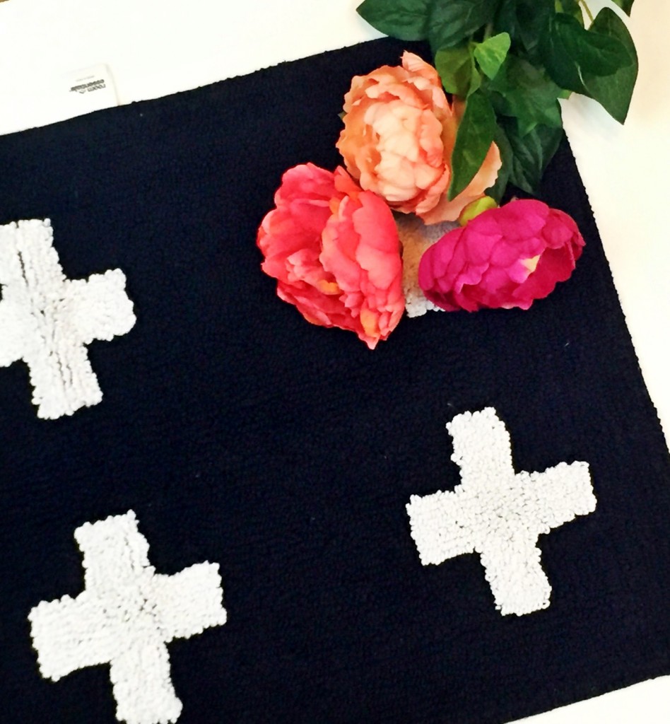
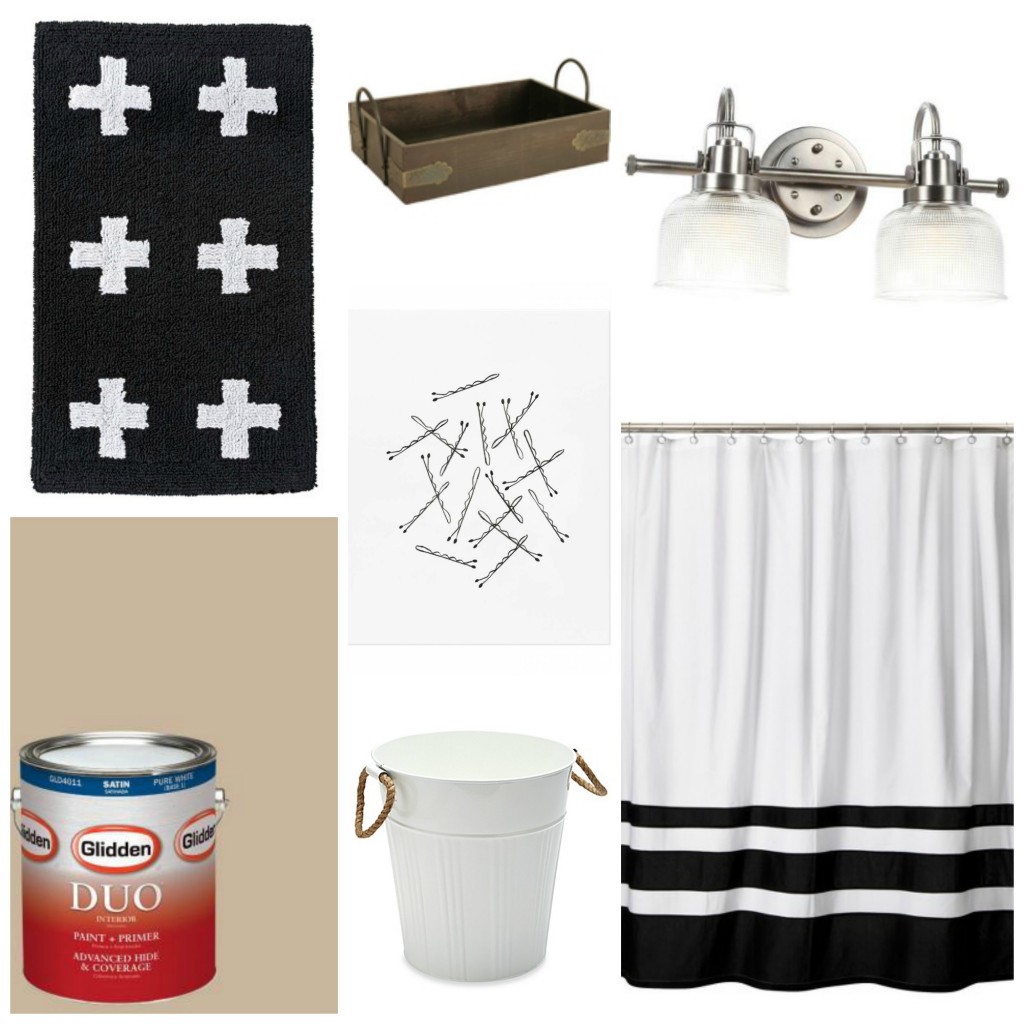
room essentials plus sign bath rug { target } || i’m kind of obsessed with the swiss cross print. it had a big surge last year but you can still find it here and there especially in home designs. knowing how popular it had been, as soon as i saw this rug at target, i immediately snatched it up. i’ve come to learn that if you see something you love in the store or online, you should buy it right away. worse case scenario you end up returning it! i love that this rug is black with white accents (as opposed to the other way around) mostly for the fact that i can drop a make-up brush on it and not have to worry about it immediately staining.
wald imports 17″ serving tray { amazon } || i hate clutter. but for someone who hates it, i sure do have a lot of “junk” taking up prime real estate on my bathroom counters! from lotions to hairspray, perfume to cotton balls, i was in desperate need of an organization intervention. i had seen serving trays be re-purposed as storage before but wasn’t quite sure if it would translate into real life. but when we stumbled upon a rustic-looking one on amazon, i knew it would be the perfect piece to solve my cluttered plight. i’m happy to report that not only is it the perfect size to hold all of the miscellaneous beauty supplies, it also acts as a great divider between the “his” sink and the “hers.” 😉
progress lighting archie 2-light antique vanity fixture { home depot } || second to paint, fixtures are a great way to accent a room transformation -especially when your current ones resemble something out of the 80’s. after scouring the home depot and lowe’s websites for months, i quickly learned that a) vanity lighting can be crazy expensive and b) there are a ton of options! i knew i wanted something simplistic but not too modern; classic and traditional that would not only work now, but more importantly ten years from now, too. finally i found this archie 2-light antique fixture in brushed nickel and knew it was the one! i preferred the nickel to the chrome since it offered a softer look and complimented the tan, black, white, and metallic color scheme perfectly. i also went for the two-light vs. three since the bathroom gets a lot of natural light on its own and because fluorescent lighting is my worst enemy.
bobby pin art print { rifle paper co. } || so this print is probably the thing i’m most excited about! i’ve never actually had artwork in my bathrooms, so i knew i wanted something fun and playful that not only tied into the color palette but made sense hanging in the bathroom (a framed photo of S & i just seemed weird). and then i stumbled upon a batch of sketched grooming tools from rifle paper co. and knew they would be the perfect compliments to the room. in addition to the bobby pins print, i also picked up this one, this one, and this one, too! i plan on getting simple black frames to put them in and hanging two of them right above the towel rack, one in the water closet, and one downstairs in the guest bath.
threshold color block shower curtain { target } || i never knew how difficult finding a cute shower curtain was until i went looking for new ones for both my master and guest bathrooms. i knew i wanted something simple, without a busy pattern or heavy fabric. ideally, i was looking for a subtle pinstripe and then i happened upon this simplistic black and white curtain from my favorite target brand –threshold. i love that it marries minimalism and subtle design. and the best thing is the white is slightly opaque so i can forgo a liner (i’m lucky enough to have shower doors so the curtain is really more of an aesthetic thing than a functional one).
asbury metal wastebasket { bed, bath & beyond } || it seems silly to care so much about a trashcan, but i was serious when i said i wanted to fill my home with pieces i absolutely loved -right down to the receptacles for dirty kleenex and used q-tips. when i spotted this metal wastebasket online, it made me smile. i love the galvanized steel and rope detailing and the way it still keeps with the “farmhouse” feel i’m trying to create without tipping too far over into “barnyard chic” territory (trust me, there’s a fine line between the two).
and finally
interior paint in “traditional tan” { glidden via home depot } || never underestimate the power of paint. it is definitely one of the easiest (and most inexpensive) ways to transform the look and feel of a room. to offset the black and white, we opted for a neutral tan hue which gives the room a cleaner sophisticated look. just remember, when painting in the bathroom or kitchen always choose a satin finish to ensure your paint job is protected from water and other condensation.
and there you have it, a sneak peek into the glamorous life of bathroom renovation.
if you’re thinking about restyling your home (a new year’s resolution perhaps?), here are a few of my favorite websites to reference for inspiration and ideas:
advice from a twenty something || magnolia market|| emily henderson || the everygirl || the effortless chic || a beautiful mess || design lovefest
happy home styling!
1




December 9, 2015
Those are all great finds… I’ll bet it’s all coming together nicely. Step back and enjoy it when it’s all finished. (happy hump day)
December 9, 2015
We most definitely will! xoxo